Blue Elephant Toy Rental Company
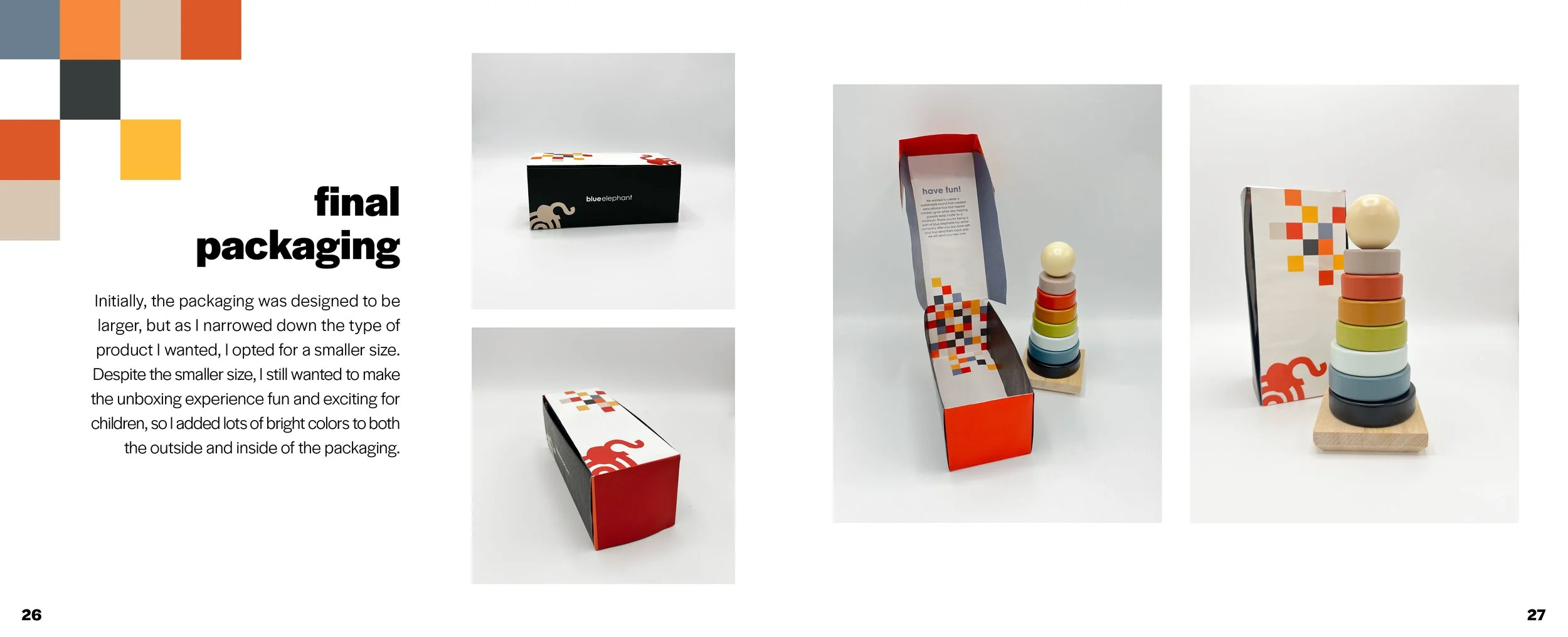
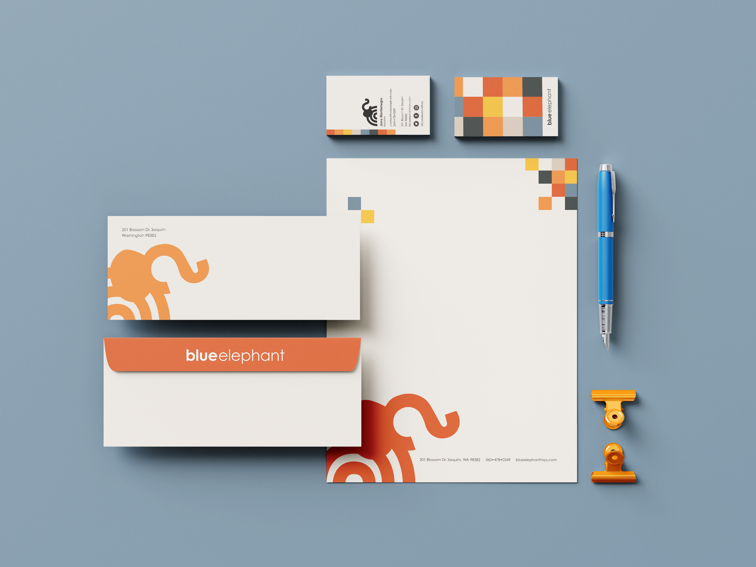
Blue Elephant originated as part of my brand identity class, where the goal was to develop a company and all of its supporting materials. This included creating a color palette, logo, brand guidelines, stationery, ads, packaging, and a process book.
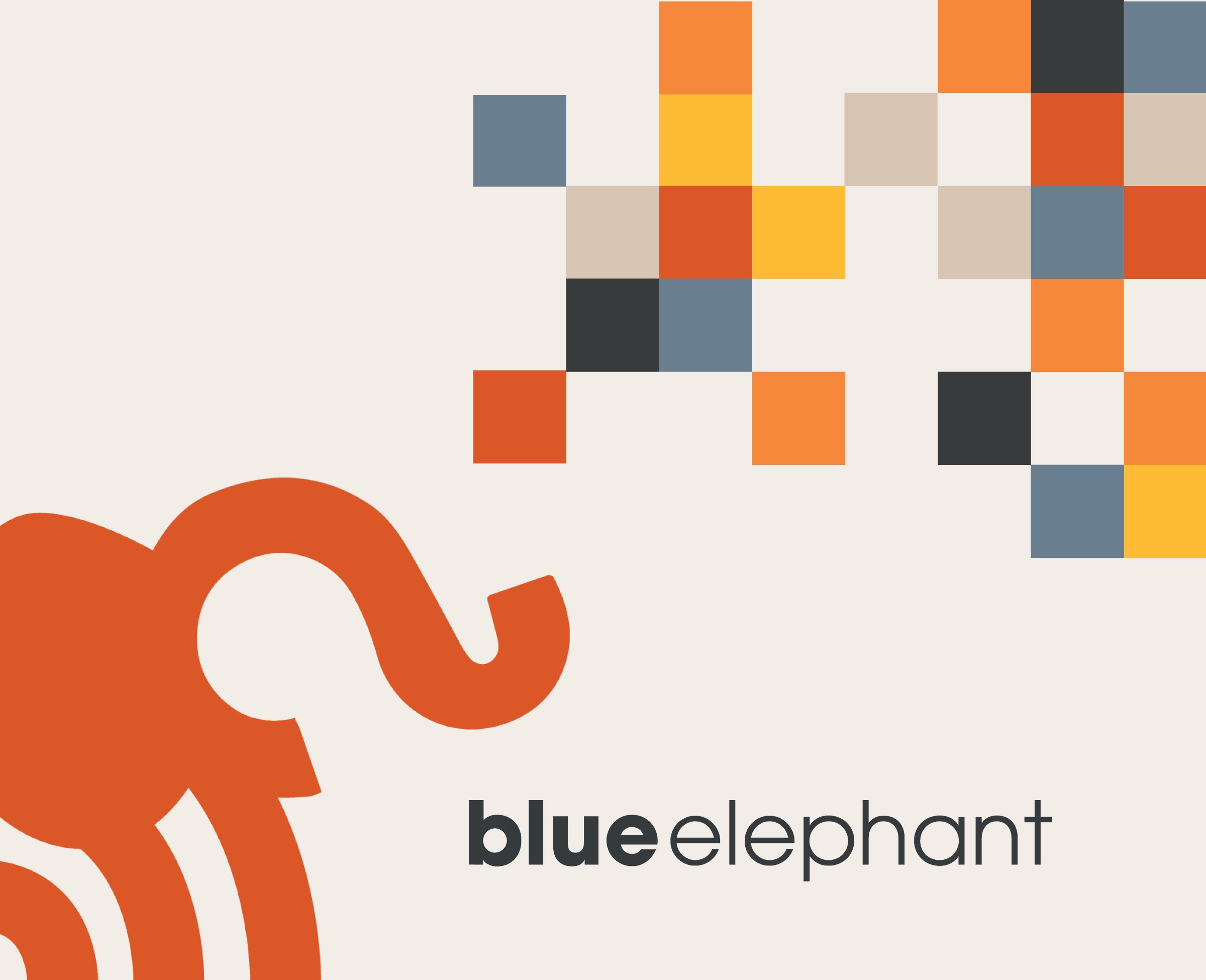
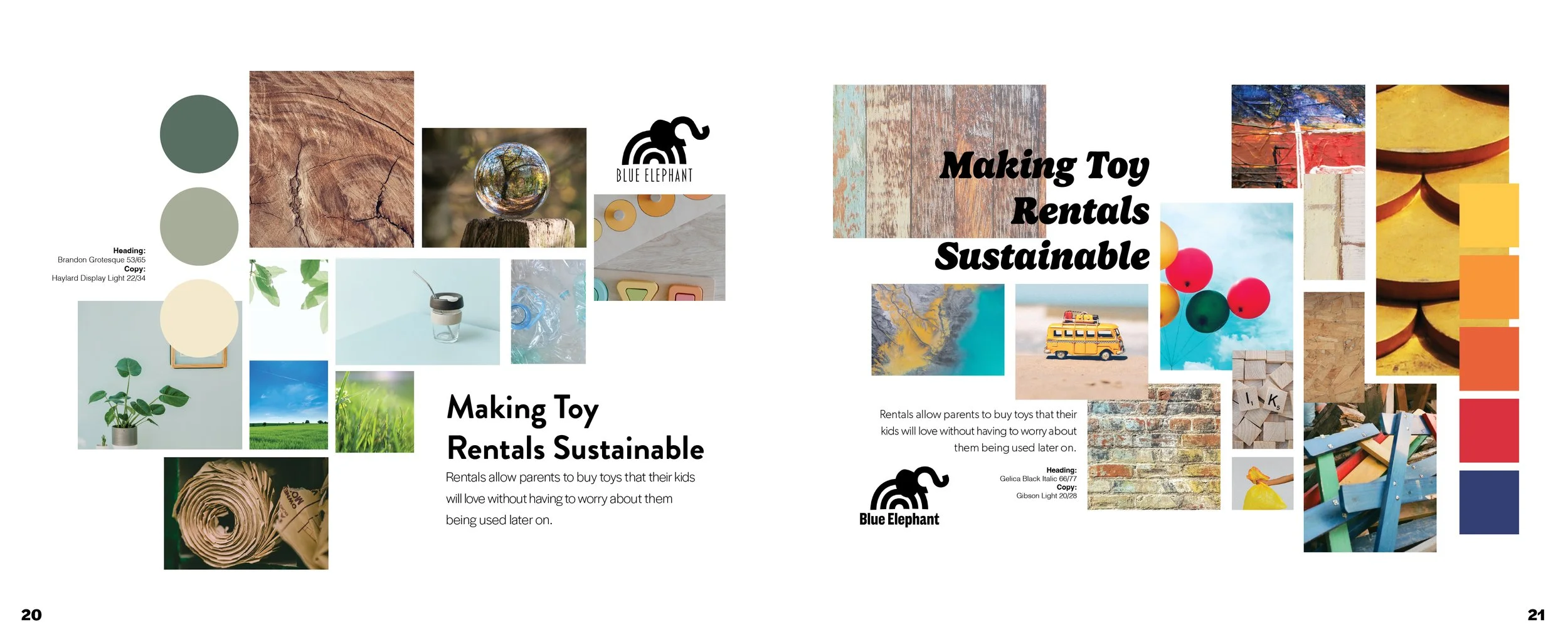
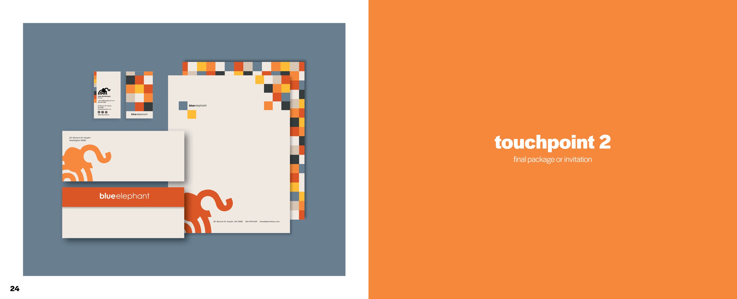
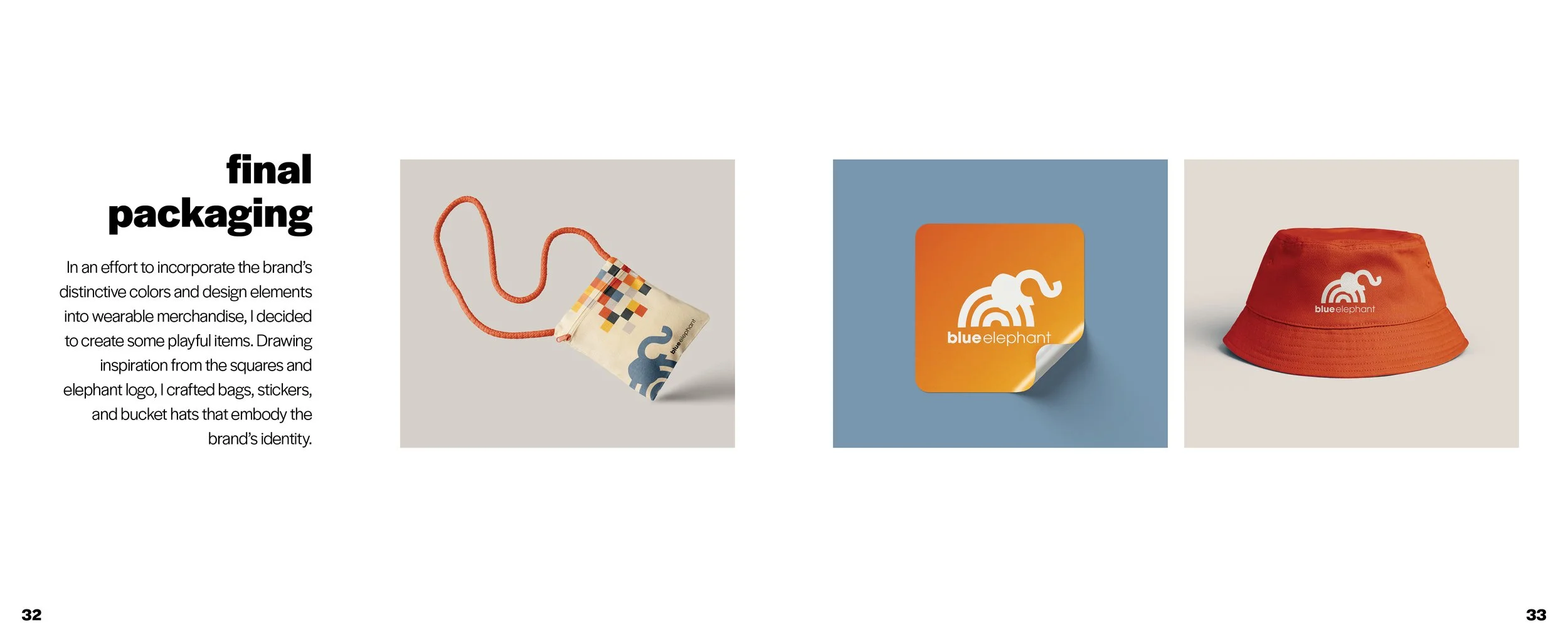
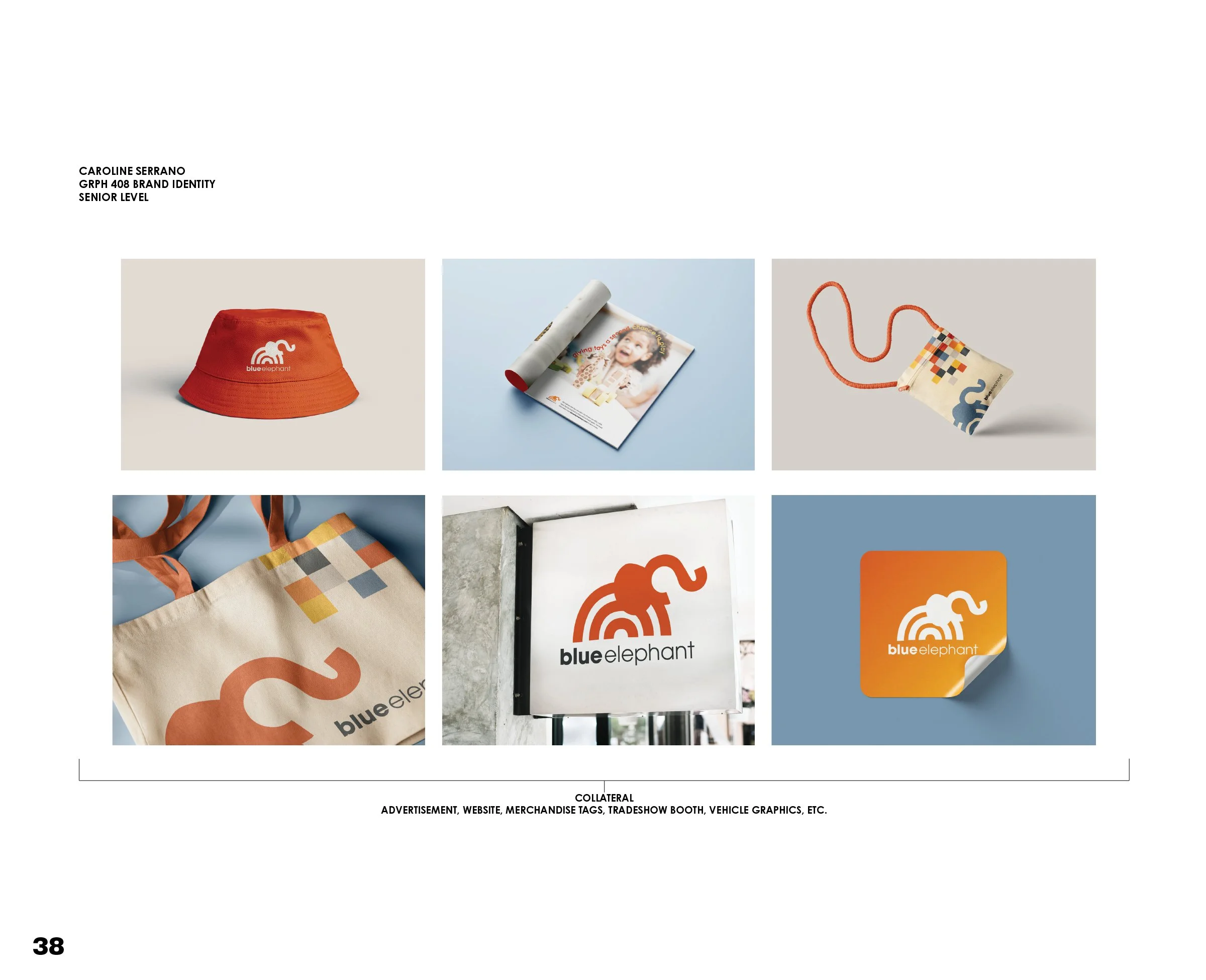
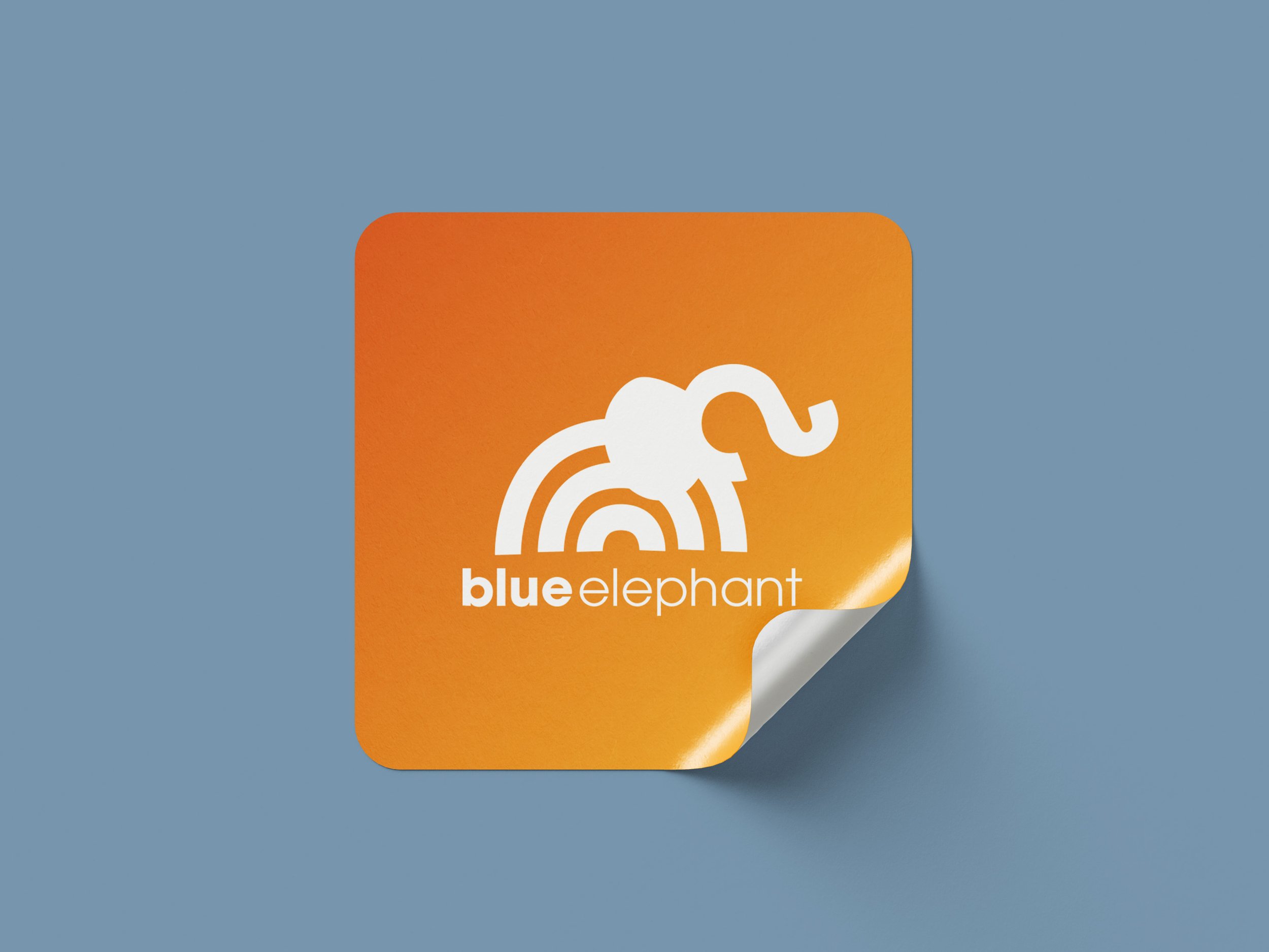
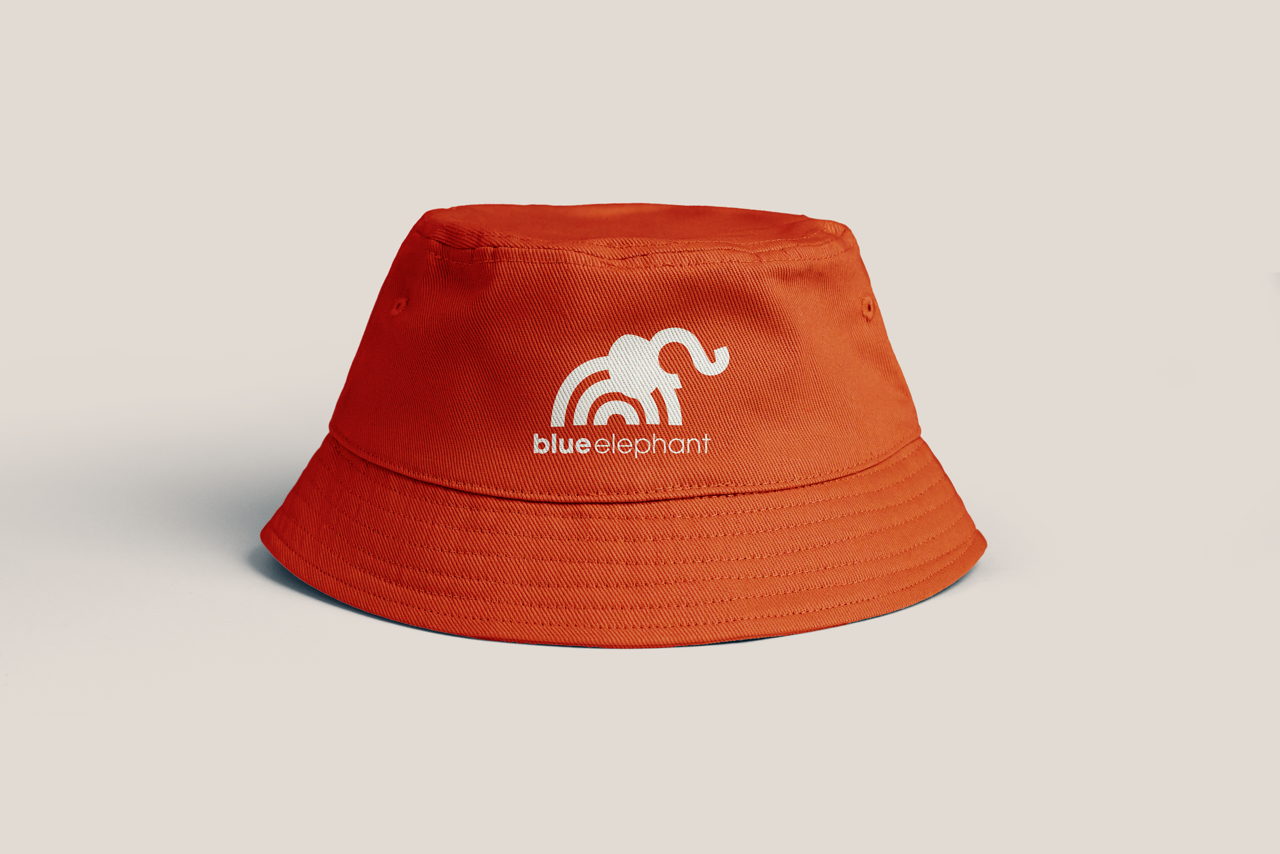
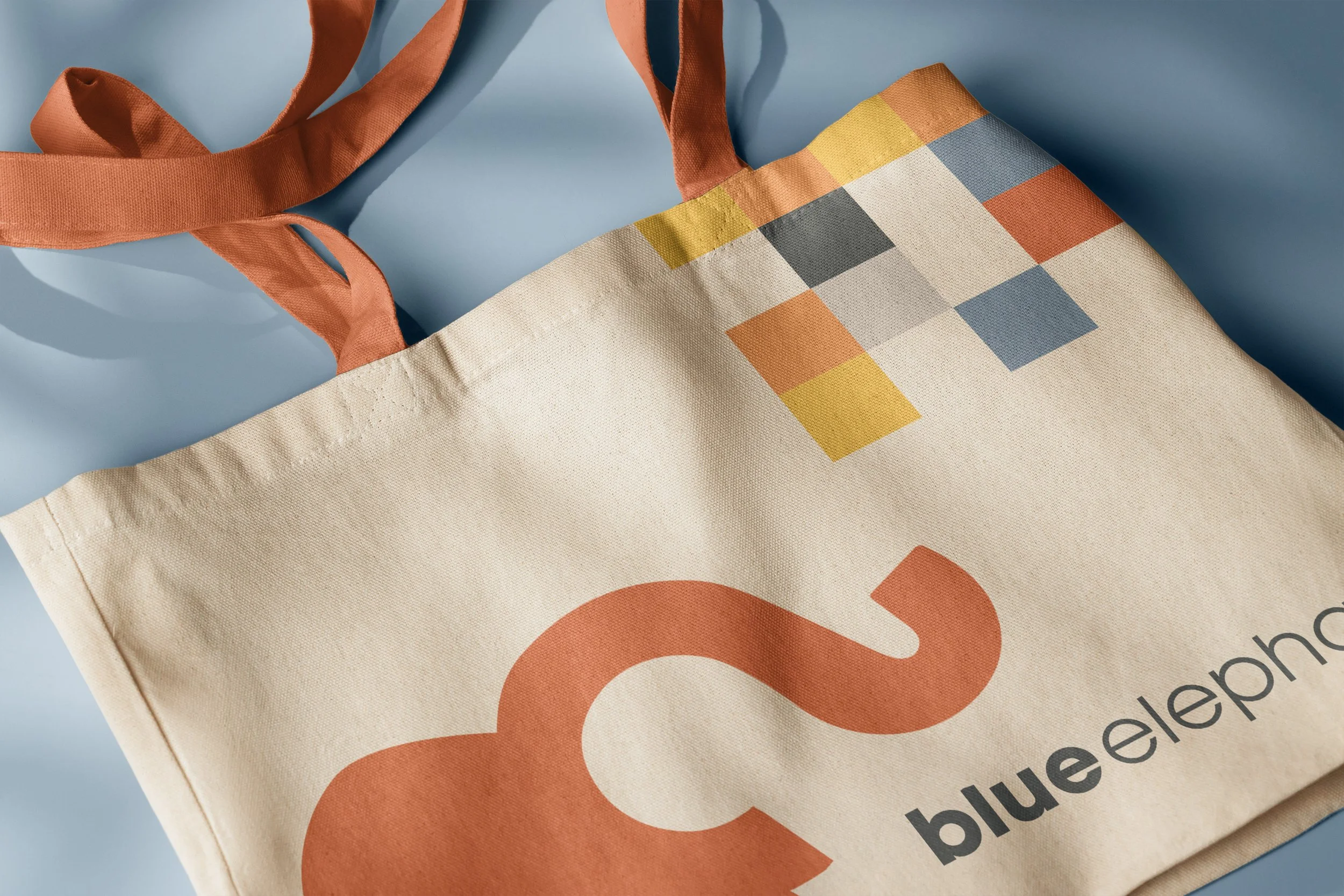
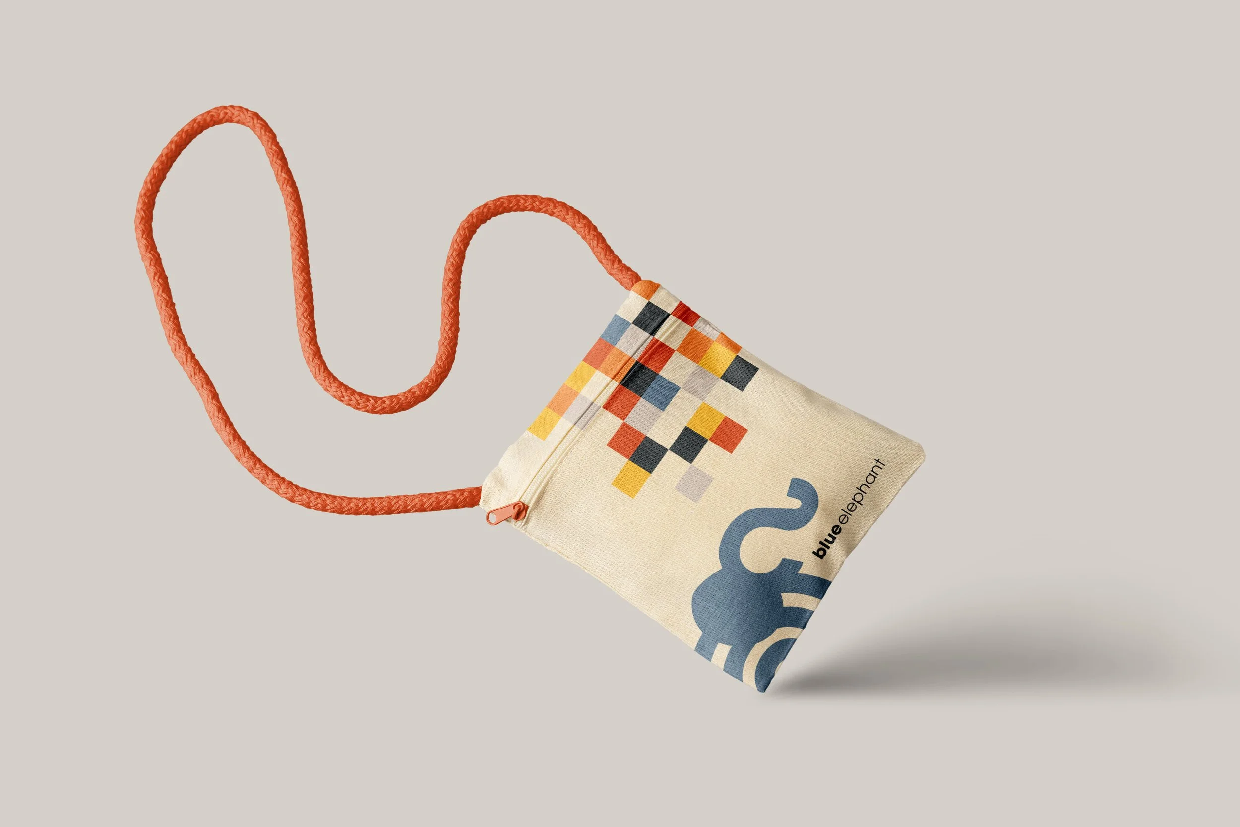
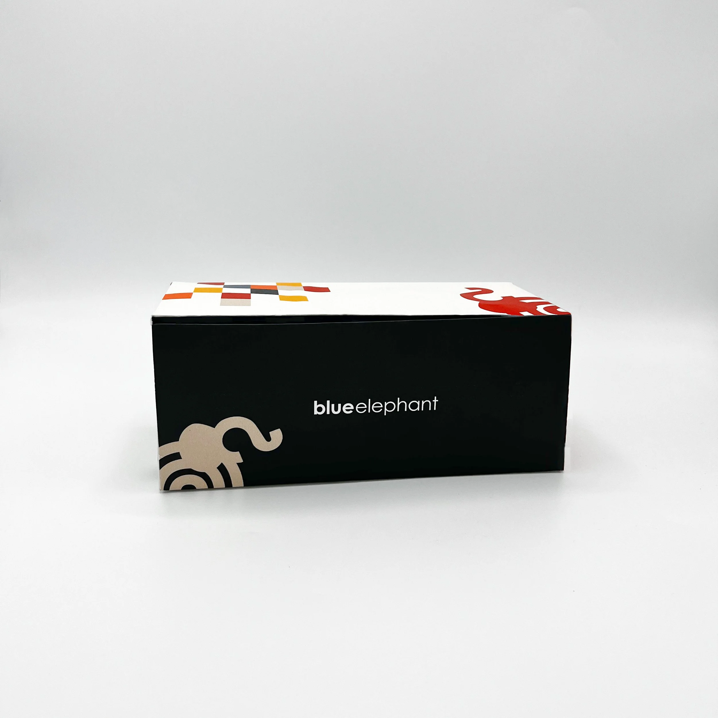
To bring more playfulness into the brand—and to move away from the expected association of the name “Blue Elephant” with the color blue—I chose to incorporate oranges, yellows, black, and beige. Blue was intentionally used as a secondary color, which felt more balanced and effective than making it a primary focus. While exploring pattern options, I landed on a patchwork design that complemented the brand’s playful, energetic personality.
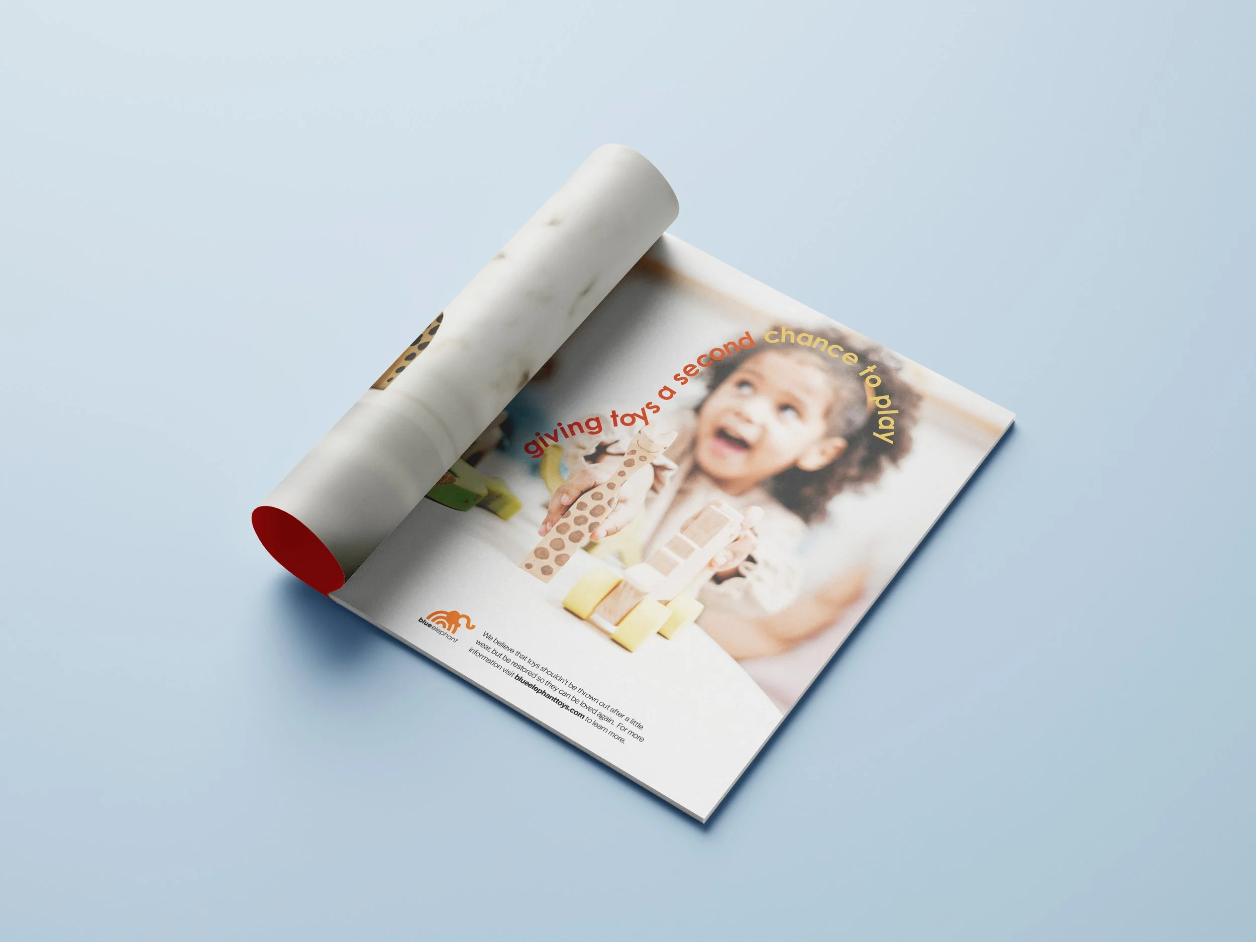
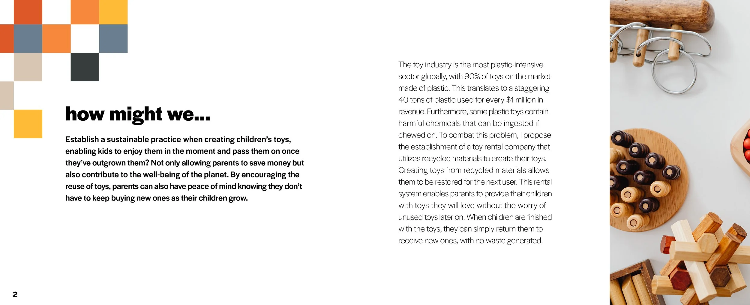
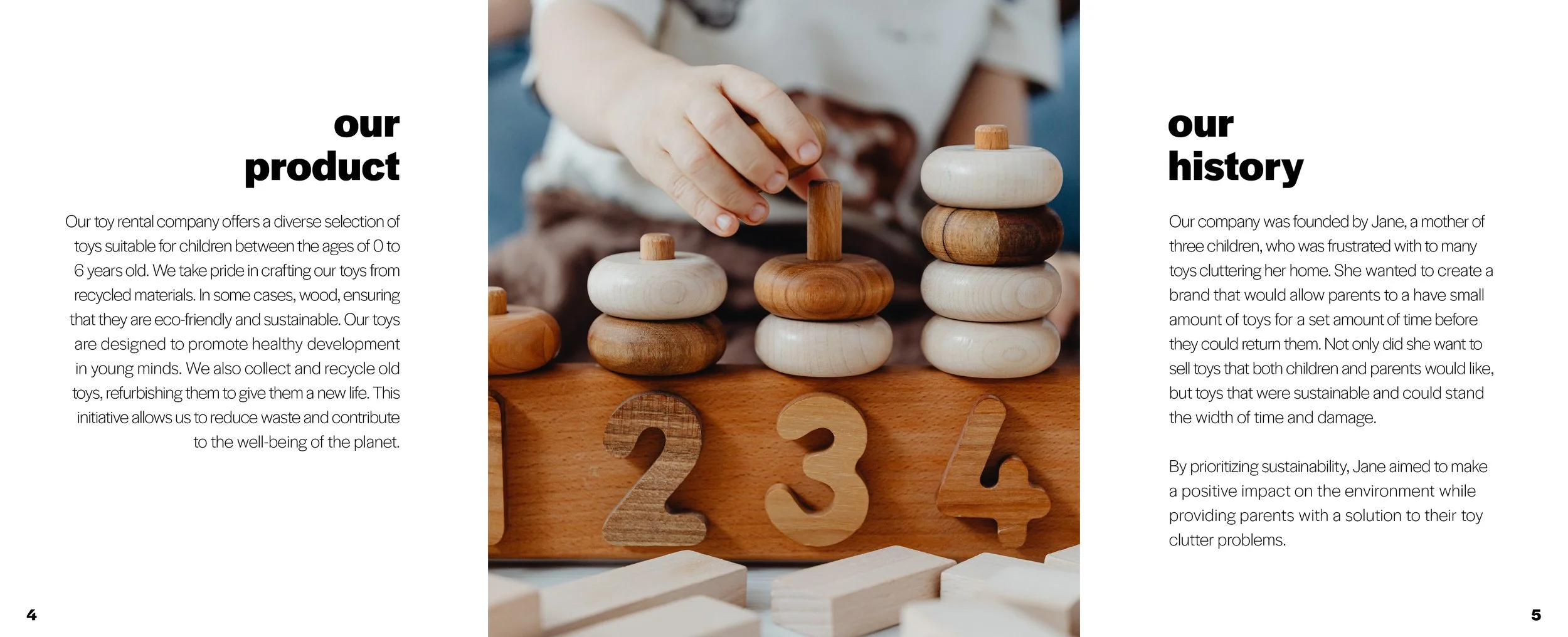
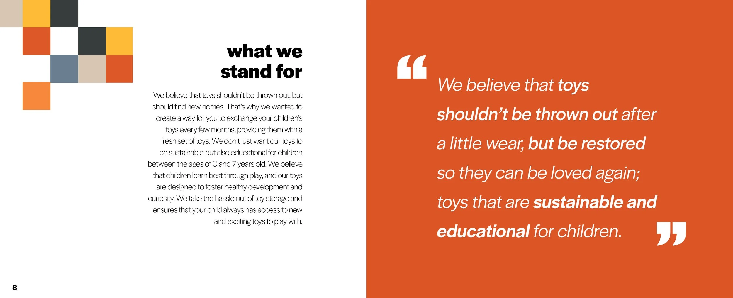
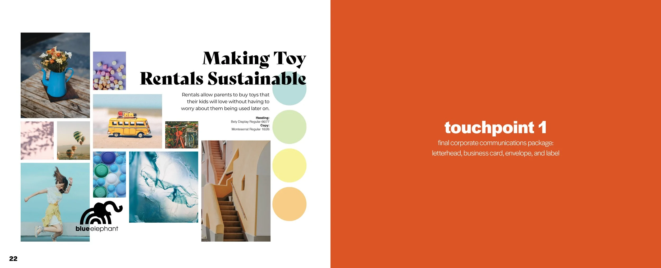
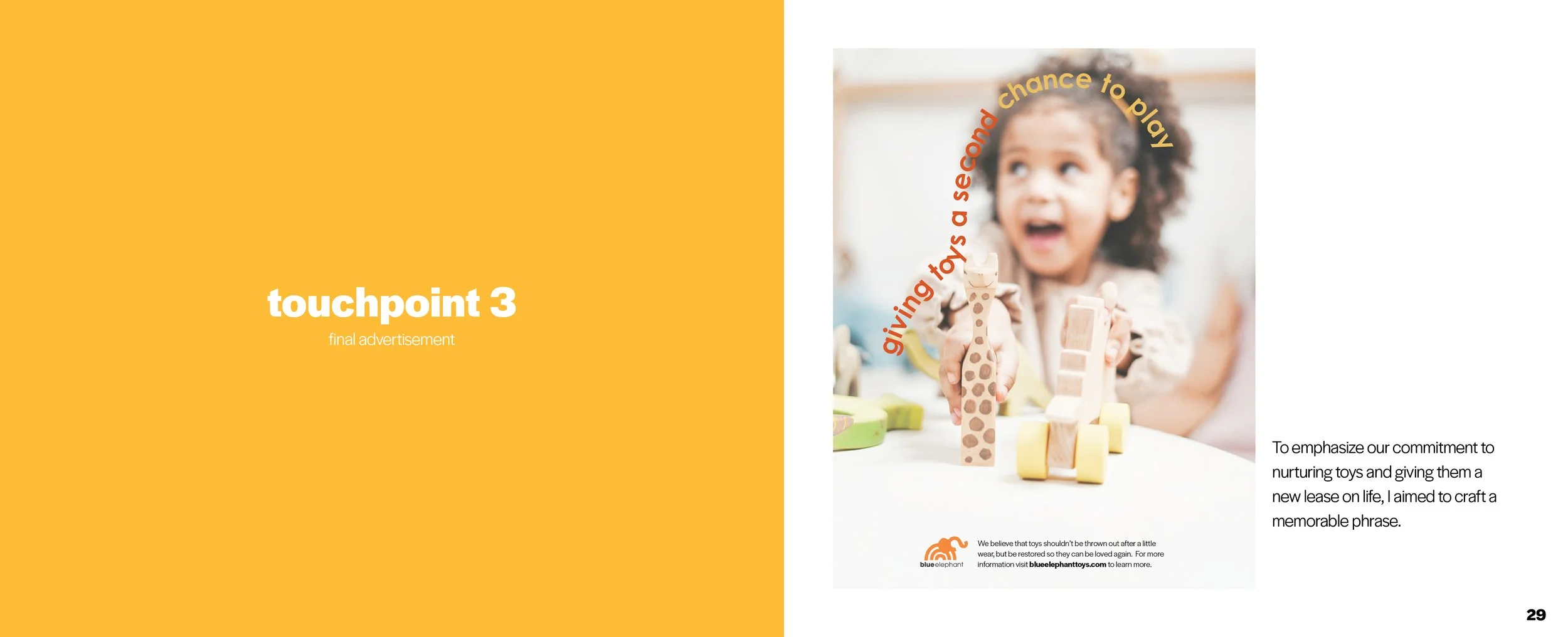
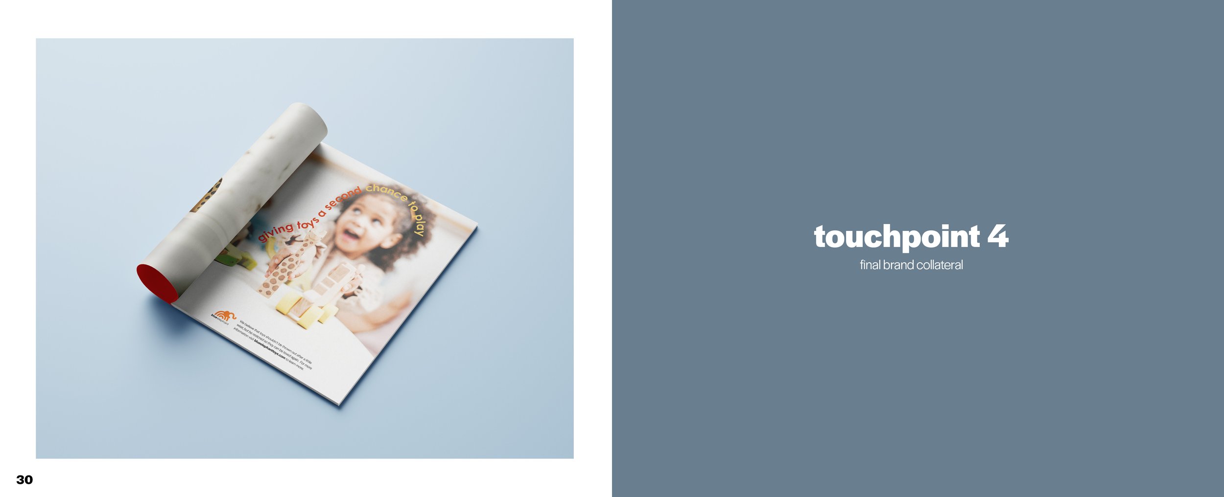
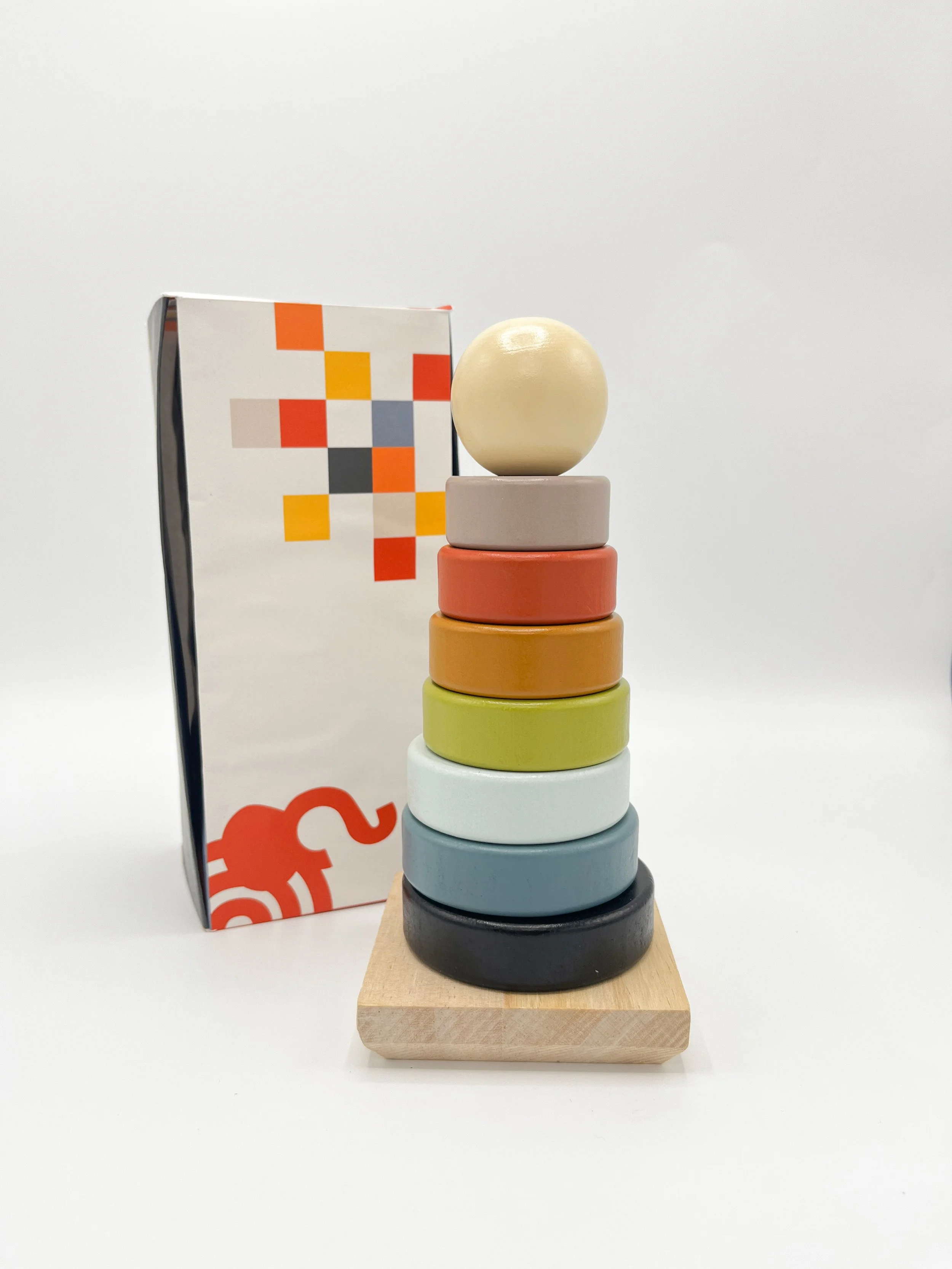
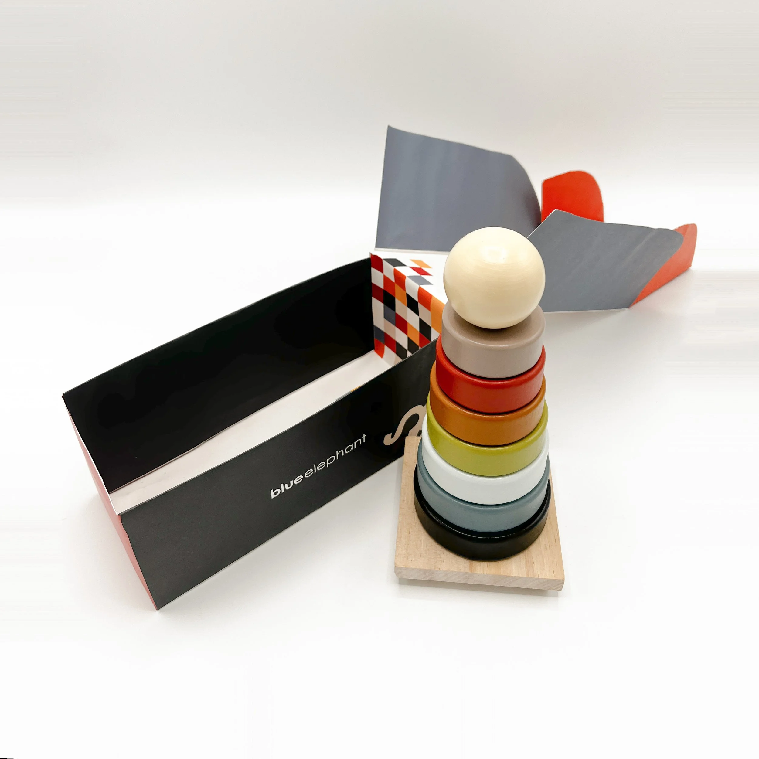
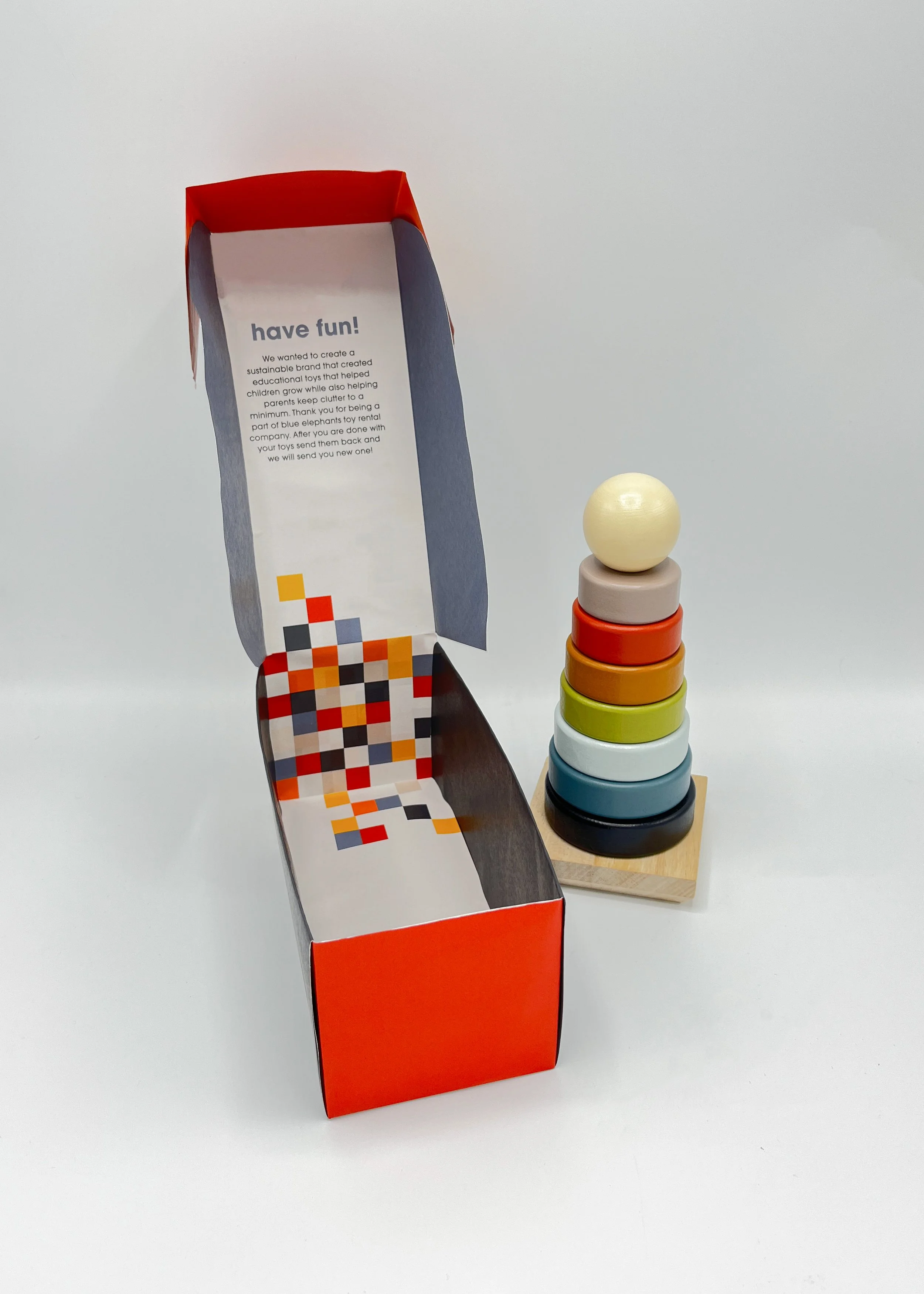
Blue Elephant believes toys shouldn’t be thrown away—they should find new homes. That’s why we created a toy exchange that lets families swap their children’s toys every few months, giving kids a fresh set to explore without the clutter. Our toys are designed to be both sustainable and educational for children ages 0–7, encouraging curiosity, creativity, and healthy development through play. By taking the hassle out of toy storage, Blue Elephant makes it easy for children to always have new and exciting toys to enjoy.
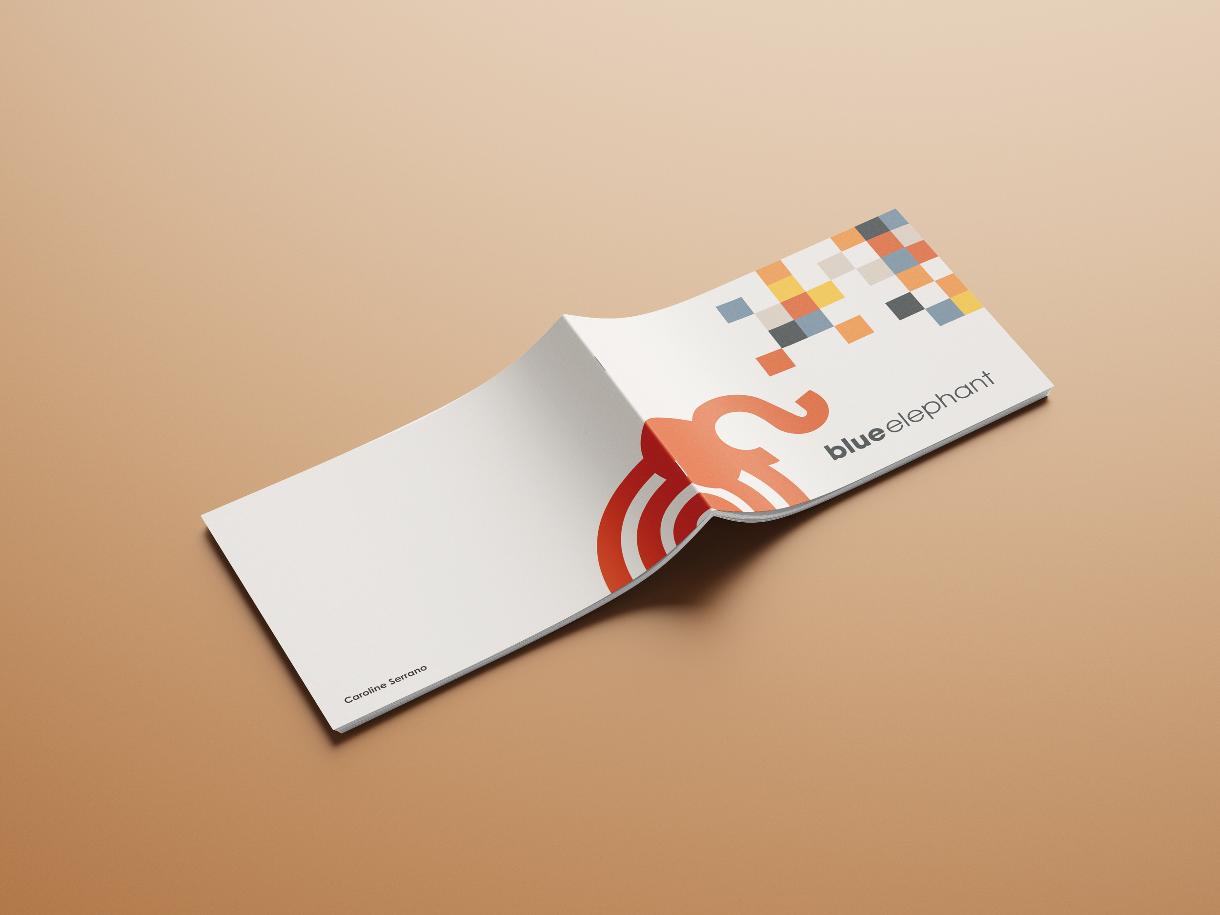
Blue Elephant Process Book
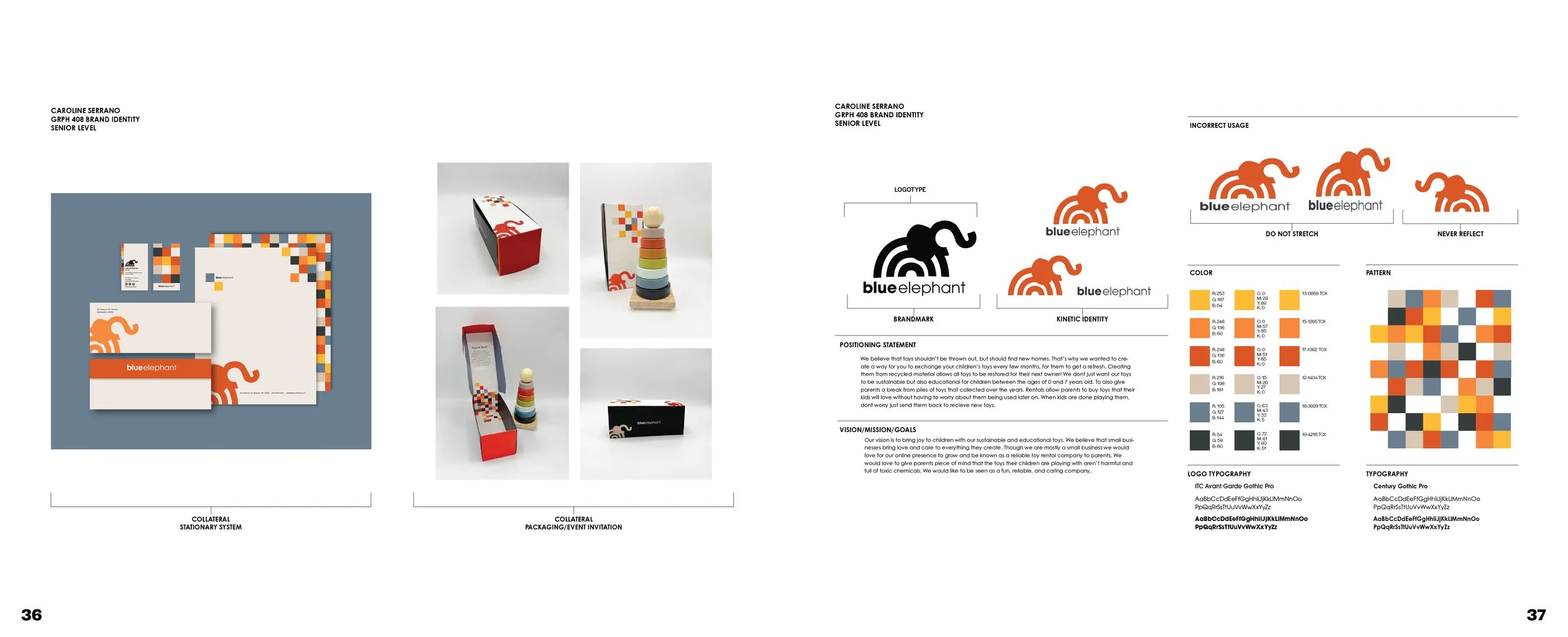
Within the process book, you’ll find a deeper look at our products, brand history, and long-term vision. It also walks through the thinking and experimentation behind the logo design. The brand guide complements this by outlining the guidelines and principles that shape the brand’s identity. Together, the process book tells the full story of Blue Elephant—its personality, purpose, and the journey behind its bright, playful identity.